User Experience
When I was interviewed for my job at Prince of Peace Lutheran Church (POP), one of the main projects I would be tasked with was redesigning their website from the ground up. This was a big job for me, considering it was my very first job after graduating college, but I was ready for it.
Strategy
My first meetings were with the Pastor and his Administrative Assistant to understand and learn about Prince of Peace Lutheran Church. We went over the mission of the church, their brand identity, their role in the community and what their vision moving forward was. We had many discussions on the problems they wanted to resolve, their timeline and goals.
Discovery
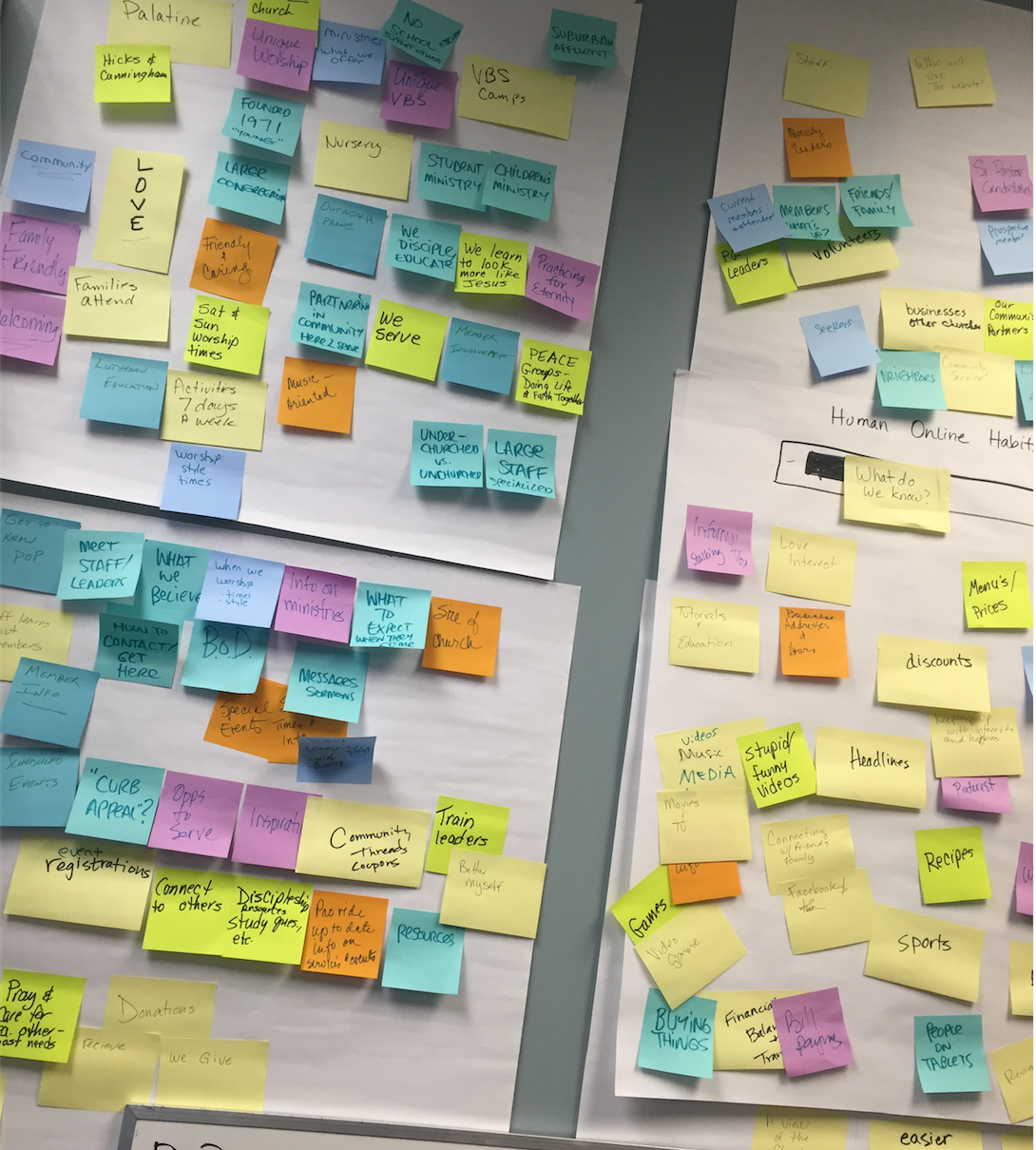
Wall of Knowledge
The meeting with the Pastor and the administrative assistant gave me a good basis to understand POP and their needs, but I needed to know more about how the staff viewed POP, their needs and uncover who all the possible users were. I led a Wall of Knowledge session with the staff and a few volunteers to discover this information. We discovered that Prince of Peace was a music orientated, loving and very welcoming church. They put a lot of emphasis in small groups. We learned that many people may use our website, from staff, to the congregation to people visiting Illinois and local businesses. The list goes on and on.
I convened with the Pastor, staff and board one on one to discuss how their experience with their current website was. They told me what was successful and what wasn’t. We looked into other church websites, especially the ones they were fond of and we discussed what they liked about that website and what it was missing. We identified the needs of the staff members since each staff member had a different role to engage with the users.
I furthered my investigation by viewing the Google Analytics from the previous website to see who the users and their web habits were:
- Users: 41% Male 59% Female
- Top 3 age groups are: 35-44; 55-64; 45-54;
- Devices used to visit site: PC, mobile (77% Apple, 33% other)
- User Interests are: Movie/Tv; News/weather; Arts & Entertainment; Travel; Music;
Notice how we are not attracting a younger audience. Also notice the overwhelming love for Apple products. This tells me that they might like clean and simple design.
I also looked up the demographics of Palatine, Illinois also gave me further insight to the community POP served:
- 30 miles from Downtown Chicago
- 14 miles from O’Hare
- 12 square miles
- Population is approximately. 69,350
- Median age: men 35.5, women 38.2
- White: 52,736; Black: 1,869; Native: 190; Asian: 7,077; Hispanics: 12,347;
- Education: 19% MA/PHD; 28% BA; 8%AD; 17% Some College; 19% HS;<HS: 8%;
- Employment by Industry: 17% Education; 16% Manufacturing; 13% Prof, Science, management administration;12% retail, Arts & Enter.; 5% Transport; 4% Construction & Wholesale Trade; 2% Information
- Median income of households: $72,510
- 9% are in poverty
Palatine is filled with young, educated families. They are also making a pretty decent income as well.
Identified websites problems
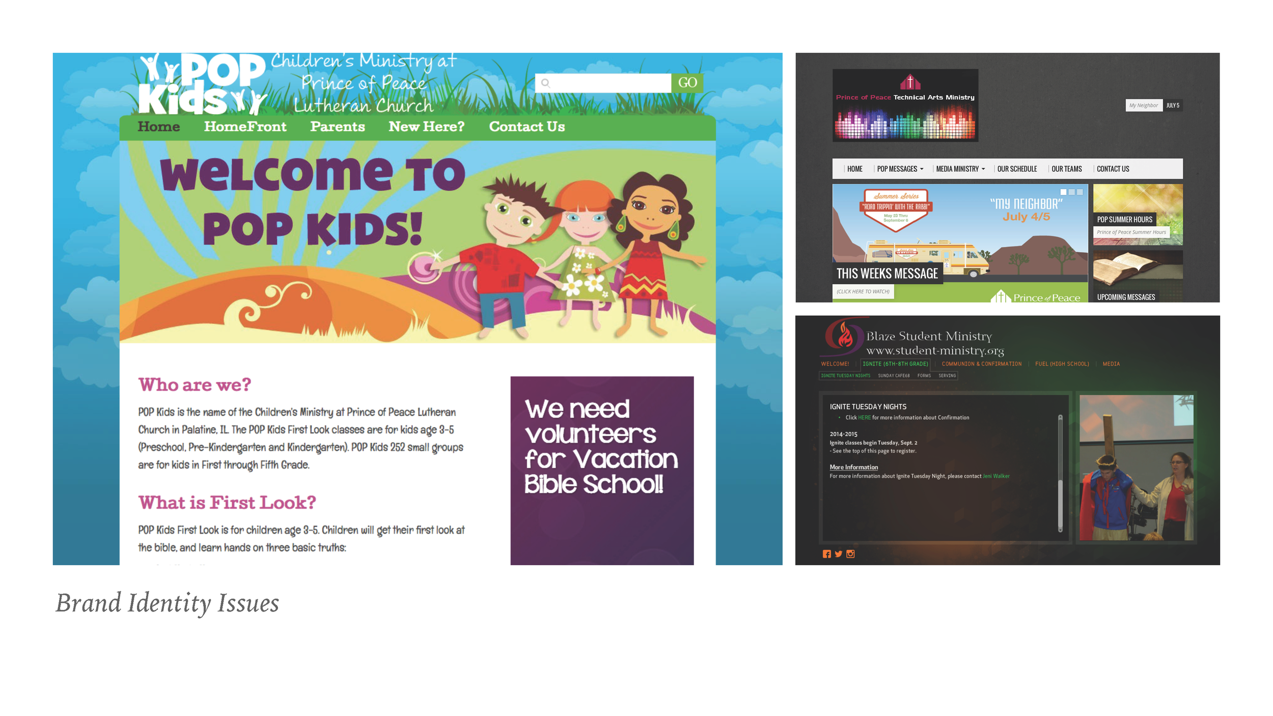
Brand Identity Issues: The staff members were frustrated that they were not able to make updates to their content when they wanted to, so they created their own sites to fit their needs. Notice how none of them look like they belong to the same church. They were all hosted on different servers, had different domains and different styles. On a couple of websites, you were not able to see the Prince of Peace Logo. People from the congregation didn't know some of these sites existed.
- Website looks dated (View Previous Website Here)
- Too much text, not enough white space or imgages
- Not inviting
- Not Fluid/Responsive
- Other websites do not look or feel as though they belong to POP
- Cannot update the website internally
- Bounce Rate is high
- No way to join small groups online
- Does not match our demographic analytics (Apple: clean, well designed, well branded)
Analysis
Architecture and interaction design diagrams
At this point I had a great deal of knowledge about POP and their users. I organized the different types of users and annotated their needs. I brainstormed solutions to address their needs and discussed it with the Pastor and the staff members. I used architecture and interaction design diagrams to workout the flow of the website. I also created some wireframes to give the Pastor and staff more of a visual idea of what I was thinking the pages would be like.
Home Page Wire Frame
Contact Wire Frame
Design
My first obstacle was figuring out how I wanted to build their website. Should I hand code it myself? Should I use Wordpress? SquareSpace? I spent time investigating which would be best solution for the staff to work with. After spending time on each platform I decided to build their website using SquareSpace. Its very easy for the staff to learn, the templates are responsive and very clean and you can use HTML and CSS to customize the pages. SquareSpace hosts the website and domain on their servers which means they deal with the security. SquareSpace is all inclusive, which is one less thing that the staff at Prince of Peace had to worry about.
Logo Refresh
The Pastor wanted me to refresh the POP logo. He wanted it very similar to how it was, but wanted more of a modern feel for it. The Previous logo had three parts to the symbol which was supposed to represent Reach, Grow, Serve, but that was never translated well to the congregation. I used Prince of Peaces building distinct building design to help influence the fresher look. I also updated the typeface to be a more cleaner and modern look.
Brand Colors
POP typically used a burgundy color for their logo and branding for many years. I expressed to the staff and board that they did not have to stick to one color. We can have a little fun with color. I showed them examples of USA Today and FedEx and how they use different colors for the different things they do. At this point, POP used the words Reach, Grow, Serve for many things. I suggested using three colors that were meaningful to the Lutheran Church.
Brand Name: POP
If you ever go to Prince of Peace, you will often hear many of the congregation refer to Prince of Peace as POP. Our previous domain name was ReachGrowServer.org, which was a reference to their mission statement. Many people knew the phrase reach, grow and serve but never made the connection to the mission statement which is where it came from. ReachGrowServe was very long to write, wasn’t catchy or rememberable. I suggested to the Staff and Board to switch the domain from ReachGrowServe.org to PopPalatine.org.
POP Palatine works not only for the domain, but throughout the church. We already had a successful program called POP Kids, so it made sense. We would be able to make more sub-brands off of POP like POP Music, POP Arts, POP Groups so on and so forth moving forward.
Brand Personality
“unlike other talk show hosts who make fun of their guests, Jimmy Fallon has fun with his guests.” - Pastor
Photo Source (DOUGLAS&NBSP;GORENSTEIN/NBC: Billboard)
During one of my meetings with the Pastor, I asked him “if Prince of Peace was a famous celebrity, who would it be?” After a few moments to think, to my surprise he turned to me and said,”Jimmy Fallon.”
I was taken a step back from this answer. Prince of Peace was a Lutheran Church, and his reply was Jimmy Fallon. I asked him to elaborate for me and he explained that “unlike other talk show hosts who make fun of their guests, Jimmy Fallon has fun with his guests.”
His answer made complete sense and was in-line with our findings during the Wall of Knowledge session we held. The staff really wanted people to feel that POP was a place that was loving, welcoming and inviting to everyone. Jimmy does exactly this on his late night show.
I called for another staff meeting to go over the Brand Personality. We discussed how we needed to show more images of the things we do at POP.
The previous website had a very formal, and corporate voice to the content. I explained to the staff that we do not need to be so rigid. We do not want to be presented as cold and unwelcoming. This was the first time that the staff would be able to update their own content, and I stressed the need for them to let their personalities shine through their verbiage. When a person reads an article, it should be like having a natural conversation with that very person. There is a very good blog on this subject that we used as a basis for our conversation by Henneke Duistermaat, How to Infuse Your Brand Voice With Personality.
This was a very fun meeting to have with the staff. For many of them, this was kind of unheard of, new and fresh. They were excited about the change and it is something we still continue to work through today.
Production
“I was talking with a prospective member this week by phone and she mentioned how easy it is to find info on our website and how much she likes it. Thought you would all like to hear!”
“Nice! I just hung up the phone with Tom who is forming a coalition of 76 local churches to form a March For Life in Palatine on October 15, 2016. He said our website was great too.”
Now that I had everything laid out, I began to build the website in SquareSpace. I set the foundation and organization of the website. I also began transferring some of the old content to the new website so the staff wouldn't work from scratch, and they would have a better understanding of what they were looking at.
I held a few training sessions with the staff, teaching them how to use SquareSpace. We set deadlines for the staff to update their content so it could be ready for the first wave of testing. The first wave was an internal focus group. The last two focus groups were external. I created surveys for the focus group members which included open ended questions and scenarios requesting them to find particular groups or content on the website. We then asked them how difficult or easy was it to find.
We went over all the surveys, and made any changes that were necessary before we went live March 3rd.


